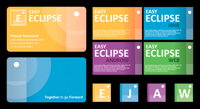
UI / UX / Branding Design
For this client a type-logo and colour design was created along with application icons, application splash screens, and business cards for their Kickstarter.
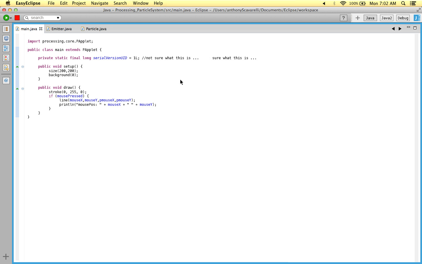
I also worked on developing mock-ups of an Eclipse makeover that would make it far more usable for beginner and advanced users (by hiding advanced functionality deeper in menus and accessible by a application wide search widget).
If the Kickstarter was successful we would have developed prototypes of thesis mock-ups and through iterative development and basic usability studies would have refined it into an application enhancement that fit the target audience’s needs.
The main functionality we would focus on, after studying the current issues with the Eclipse IDE, is as follows:
- Re-organizing menus to have less secondary and tertiary information in in the primary views; and instead moving secondary / more advanced information to secondary-level menus and within a search widget always visible.
- Increase working space by implementing a system that hides all secondary views whenever possible; with a basic right-hand navigation menu using basic iconography. By hovering over a view it will show up temporarily for a “quick view”, but clicking on the icon button toggles the view to stay open until the icon is clicked again.
Though ultimately not successful this Kickstarter was an interesting exercise in building upon an entrenched UI and UX precedent to make it more accessible.
More minimalisic UI goal
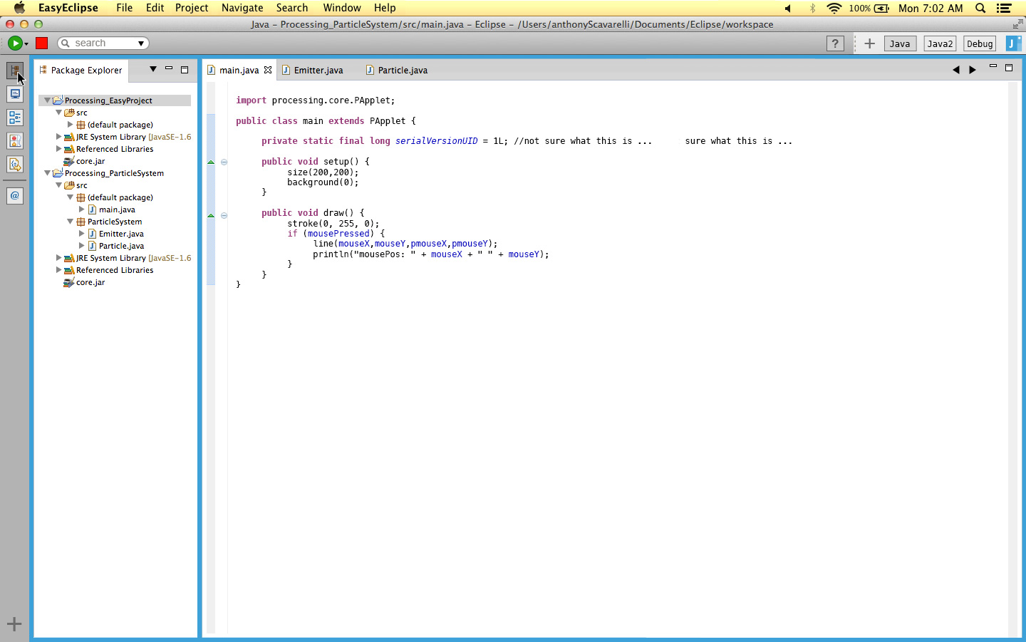
Hover to open a view temporarily
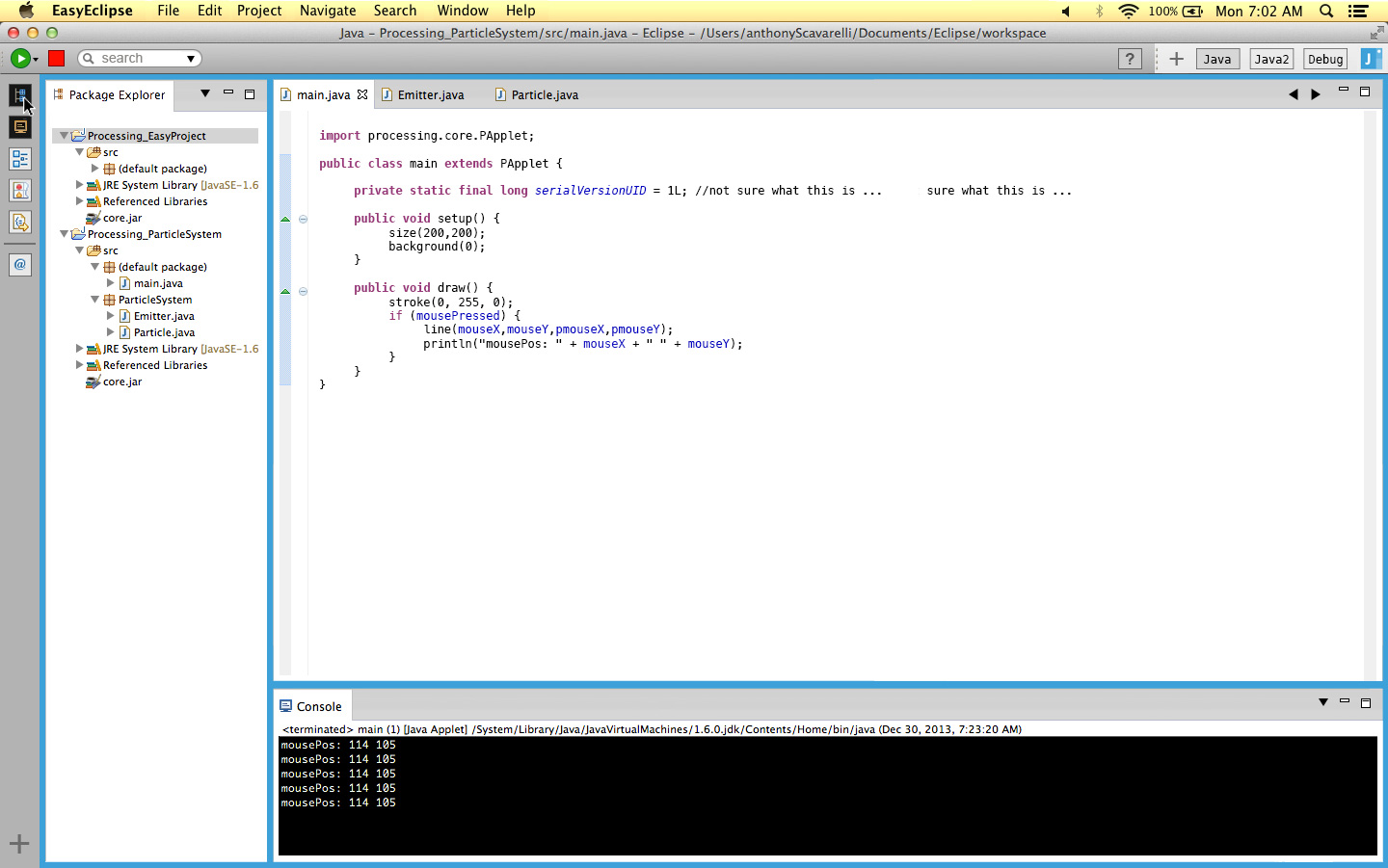
Toggle to persist view